Deutscher Literaturfonds
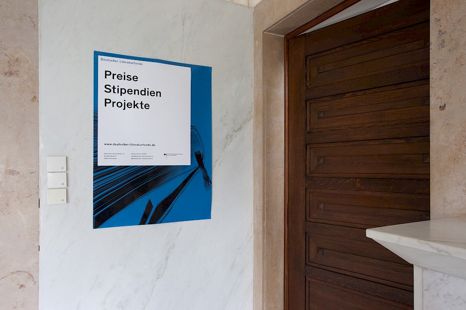
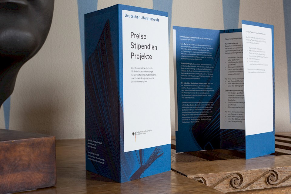
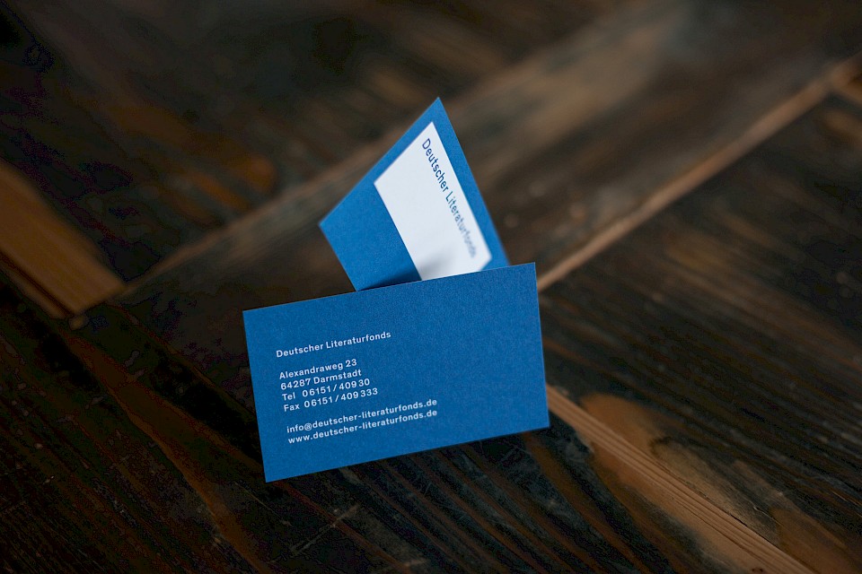
In 2017, in cooperation with Prof. Sabine Zimmermann and Su Korbjuhn, we developed a comprehensive redesign of the corporate design for the Deutschen Literaturfonds, which replaced the previous design for the 2017 Frankfurt Book Fair. The center of the visual identity is the new brand, which stands as a transparent element on a white surface. The background surrounding the areacan be seen through the transparent wordmark. The white area embodies the symbolical space created for the scholarship holders by the support of the German Literature Fund within the literary landscape; the transparency of the word mark however keeps the connection to the background intact.
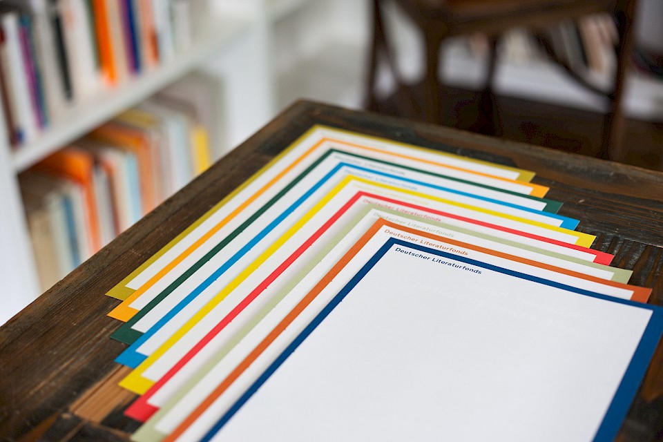
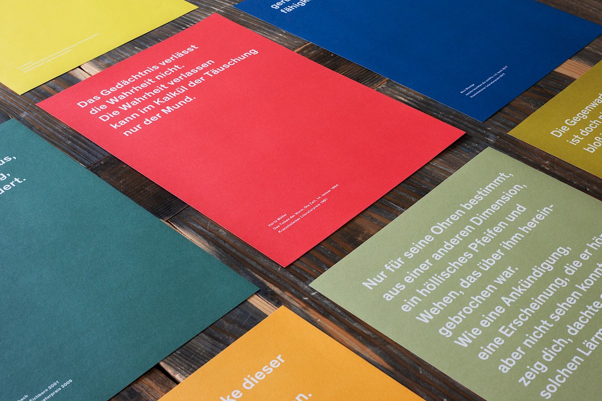
In addition to the main color, a rich ink blue, a number of different colors have been defined which will be used annual for communication on flyers, posters and the website. Thus, over the years, a multi-colored visual appearance develops, which refers to the rich and varied literary landscape and gives each year its own identity. Where possible, the colors are printed as Pantone solid tones to ensure a crisp print image. The design is united by the uniform placement of the brand, the typography and the use of the white area as a background. For more complex means of communication key visuals have been created, which stage the book as an object.
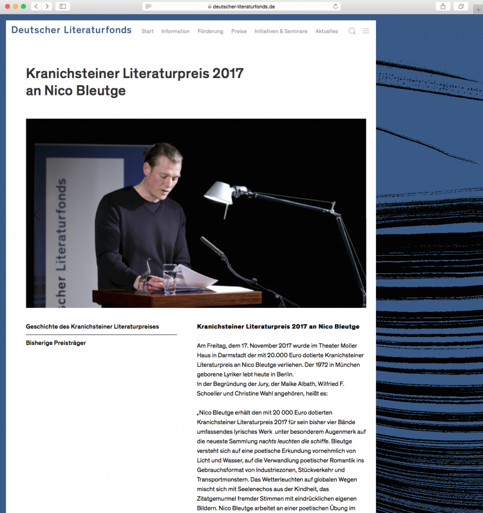
The website has also been completely redesigned and not only adapted to the new visual identity, but also technically modernized and simplified. By using ProcessWire as a content management framework, the editors now benefit from a clear and easy-to-use management interface. For the visitors of the website the content structure was simplified and the overview was improved by clearly recognizable principles of order.
